Proud partner

Proud partner
Article

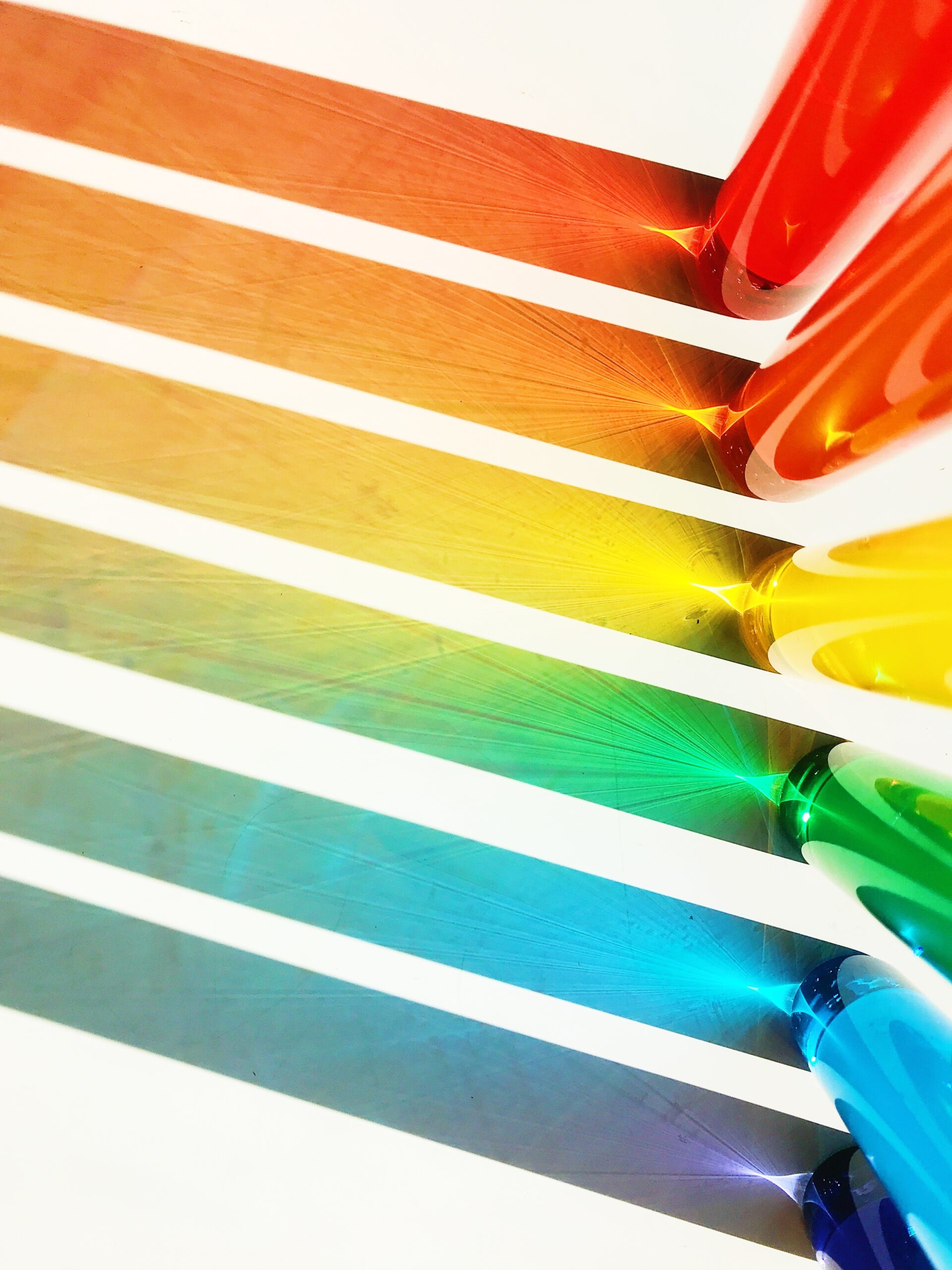
Do you feel calm and secure when you see the colour blue? Or perhaps enthusiastic and optimistic as soon as you see the colour yellow? It is well known that colour generally has a powerful psychological effect on people’s emotions and decisions. That is precisely why it is important to carefully consider the colours you choose for the visual aspects of your marketing campaign and your company’s branding. A poor choice of colour can ruin a brilliant idea and even result in a less effective call to action.
By ‘colour psychology’, we mean the study of colours in relation to human behaviour. The aim here is to determine how colour influences purchasing decisions. Does the colour of a shirt make us decide to buy it? If we give an icon a particular colour, are people more likely to click on it? Does the colour of a packet make us choose that one over another? The short answer is: yes. But why that is the case is a little harder to explain. The meaning of colours can influence the choices we make and why we prefer one colour over another. The same colour can also have different meanings depending on our upbringing, gender, location, values and a variety of other factors.
The colour red quickly catches the eye. Red symbolises excitement, passion, danger, energy and action. You may well have noticed that ‘order’ buttons are often coloured red, or that this colour is used to make items on a shelf stand out even more. In colour psychology, red is the most intense colour. So it’s hardly surprising that it is capable of evoking strong emotions. Many brands opt for the colour red – think of Coca-Cola, Lays, Kellogg’s and KFC. This makes sense when you consider that the colour red tends to stimulate the appetite. YouTube chooses to use red because of the excitement associated with watching videos online.
Red is also often used to indicate danger, so be careful with this colour. If you choose to use this colour on the website, reserve it for call-to-action or sale buttons, as this often creates a good contrast. Customising buttons is one aspect of on-page optimisation.
Orange is the colour of innovation, creativity, enthusiasm, success, adventure and balance. Whether it’s a website, a photograph or marketing material, this colour adds a touch of fun. Although this colour is appealing, it is slightly less powerful than red. Marketers also often choose this colour for calls to action or areas on a website that need to be highlighted.
When you think of yellow, you think of the sun. It evokes feelings of happiness, positivity, optimism and summer. Some brands use yellow as the background colour of a website or in a banner at the top of the site to make it stand out even more. A touch of yellow often evokes positive associations among website visitors. Brands that use yellow include Ferrari and Ikea. For instance, it is a dream for many people to drive a Ferrari one day. The brand is associated with happiness and a carefree lifestyle. In the case of Ikea, people who buy furniture are often moving out of home for the first time or have bought a new home. These are milestones that go hand in hand with a sense of happiness. Yellow is therefore the perfect colour to associate with the brand.
In colour psychology, this colour symbolises femininity, playfulness, immaturity and unconditional love. Some brands choose to use the colour pink specifically for the product packaging of girls’ toys. Whilst other brands emphasise the colour pink in their logo, website design or to highlight important messages. Given that the colour pink symbolises femininity, it is no surprise that brands such as Victoria’s Secret and Barbie have chosen this colour.
When people think of the colour green, they often think of nature, but this colour is also associated with money, fertility, growth and health. It is the colour of pure harmony and often has a relaxing effect. There are negative associations too – just think of ‘green with envy’. In the field of marketing, this colour is frequently found in sectors active in healthcare, sport, the environment and leisure.
The most popular colour for a brand is blue. This cool colour puts people at ease and symbolises trust, calm, authority, wisdom and reliability. Blue is the colour of the sky, the ocean and coolness. Blue can be used in your website’s logo or in the navigation on your website. Some retailers choose blue for their guarantee, trust certification or free delivery to reinforce the trust that the colour is known to inspire.
Purple is a regal colour and symbolises power, luxury, wisdom and spirituality, but it is advisable not to use this colour too much. An overuse of this colour can also evoke feelings of frustration. Well-known brands that use this colour include Hallmark and Yahoo. If you take a look at their websites, you’ll see that it’s used as an accent colour. Would you like to add a touch of purple to your website because it fits well with the image you want to project as a brand? Then consider incorporating some purple into your logo, using it as an accent colour in images, or making your free delivery banner purple.
White is the colour of innocence, purity, goodness and humility. Bear in mind that in some parts of the world, white can also have the opposite meaning; it can also symbolise sterility and coldness. When it comes to websites, white is one of the most commonly used colours. A white background with black text is often chosen, as this colour combination offers the best readability. Brands such as Adidas and ASOS use white in their logos, usually to create contrast.
Another popular colour is black. It exudes strength, elegance and professionalism. Furthermore, this colour can also evoke powerful emotions, such as anger and sadness. In the fashion world, black is often chosen for logos. Think of Chanel and Nike. Black is also chosen for lifestyle banners where creating a particular atmosphere is important. Black, combined with white, creates a good balance. If your background is white, you can choose to make your call-to-action buttons black to draw attention to them.
Grey represents neutrality and balance. The meaning of the colour likely stems from its position between white and black. However, grey carries a number of negative associations, particularly when it comes to depression and loss. The absence of colour makes it dull. You can use grey for text colours, headings, images and even products to appeal to a wide audience.
Apple is an example of a brand that uses the colour grey in its branding. After all, many of their laptops have a grey or silver hue; this neutral colour puts no one off. On their website, they use grey for their header to contrast with a white logo. However, throughout their branding, you see a balance between white, black and grey that helps to maintain a clean, neutral look.
The earth tone we are all familiar with is brown. It is the colour of wood, earth and stone. The colour emphasises comfort, security and a down-to-earth character. In marketing, brown is often used for natural products and food. Brown is a colour featured in logos, banner images and sometimes even text, due to the contrast it provides against a white background.
It is not just the meanings associated with colours that play a role in choosing the right colours for, say, your website. Content is sometimes much easier to recognise when it stands out against the rest of the site. Research shows that people prefer similar colour schemes or shades that feature a contrasting accent colour, such as analogous colours. Speaking of contrast, did you know that there are around 700,000 colour-blind people in the Netherlands? Someone who is colour-blind cannot tell the difference between green and red – colours that are often crucial for signalling something on a website. So that’s yet another reason to pay attention to colour contrast on your website.
Would you like to put the meaning of colour and its influence into practice? You can do this by consciously considering which colours to use on your website. Just imagine that, thanks to the meaning of the colour yellow, all your website visitors develop a positive association with your website and, as a result, return more often…
The colours you see on a screen (including as you read this blog) are mixed from the three colours red, green and blue (RGB colours). All three of these colours have no fewer than 255 shades, so there’s plenty of choice when it comes to selecting the perfect colour for your website! For the colours red, green and blue, the intensity is determined by a number between 0 and 255; the higher the number, the more intense the shade! But how does adding a specific colour actually work? Through the use of HTML colour codes!
To identify the meaning of colour on your website, you can use HTML colour codes. This code consists of six digits or letters and is preceded by a hashtag (#). These six digits or letters fall into three categories: the first category (digit/letter 1 and 2) represents the intensity of the colour red, the second category (digit/letter 3 and 4) represents green, and the third category (digit/letter 5 and 6) represents the intensity of the colour blue. Although the intensity – as mentioned earlier – is represented by numbers from 0 to 255, the colour code is shown in hexadecimal (between 0 and F). Thus, the colour red is represented in the colour code as: #FF0000, the colour green as #00FF00 and the colour blue as #0000FF, where F stands for 255 and 0 stands for, yes, zero. Another interesting example is the use of black or white. If you want to add the colour code for black, you’ll need to use #000000. If you want to add white, you’ll need to use #FFFFFF. In other words: RGB colours at their maximum intensity versus RGB colours at their minimum intensity.
There is no one-size-fits-all solution when it comes to choosing the colours for your website, marketing campaign or brand. Context – that’s what it’s all about. It is the feeling, the mood and the image that your brand creates that play a part in winning people over.
Now that you know a bit about colour psychology and what most colours represent, it’s time to apply them to your brand. Choose colours that represent what your brand has to offer or how you want your customers to feel when they visit your website. Want to know more? Feel free to get in touch!




Our team is
ready to help you